What is a Call to Action (CTA), How to Create One, and Examples for Inspiration
If you want to persuade visitors to take action, you should know that the Call to Action (CTA) is essential.
This element is used to indicate and guide users toward the action your company wants them to take.
Created long before the digital age, the CTA was already present in print and television advertisements.
Remember, conversions on your pages depend on the CTA to actually happen.
After all, if you don’t call the person to action, who will? 😉
To better understand what a Call to Action is, how it works, how to build one, and how to measure its results, keep reading this post.
Let’s start by diving deeper into what a CTA is! 👇
What is a Call to Action (CTA)?

A Call to Action is a prompt for action.
This structure is widely used in materials such as websites, landing pages, email marketing, and ads—typically in the form of a button that directs the user to click or take another specific action.
A CTA is usually short, clearly encouraging an action, and using imperative verbs like “click,” “sign up,” or “access.”
Visually, it stands out from the rest of the content to attract attention.
We’ll explain these characteristics in detail throughout this article.
Why is a Call to Action Important?
If your goal is for your reader or visitor to take action after interacting with your content, you need to make that clear to them, right?
Using a CTA makes this action a priority while also encouraging the visitor to stay engaged with your brand—whether by clicking a link to another piece of content, providing an email, or signing up for a free trial of your product.
With a well-crafted and well-positioned Call to Action, you can:
- Keep users engaged;
- Help create a user-driven customer journey;
- Measure results more easily;
- Increase conversions;
- Prompt users to make immediate decisions.
What are the 3 key elements of a CTA?
If you thought a CTA was just a few words and boom, it’s done—you’re mistaken.
A Call to Action is a combination of three elements that work together to create a powerful prompt for action:
- Copy
- Placement
- Design
Let’s break them down below!
Copy
Copywriting is a writing technique used to enhance materials like websites, ads, social media content, email marketing, blog posts, e-books, and CTAs.
Simply put, copy is the phrase that makes up the CTA.
However, generic phrases like “Sign up,” “Try now,” and “Get started”—although persuasive—are not fully optimized.
A strong CTA copy clearly communicates your company’s value proposition, explaining what the user will gain and how their life will improve when they click the button.
For example, instead of writing “Get started now,” try “Increase your conversion rate.”
Another great strategy is using the first-person perspective in your CTA.
Example: Instead of writing “Claim your coupon now,” write “I want my coupon.”
Let’s look at an example from Firstleaf:
The button copy says “Send me the best 3-pack,” which gives users a sense of control over the action.
Placement
If your CTA is placed in the footer of your website’s homepage, we can say with almost 100% certainty that you won’t get results.
That’s why carefully choosing the placement of your call to action is essential for its effectiveness.
Your CTA must follow the natural visual hierarchy that our brains use to process content.
In other words, the most important elements on your page should stand out through size, color, or contrast within the section where they are placed.
Let’s look at an example from Indochino.
As shown below, they placed multiple CTAs throughout the page, but the first one stands out the most.
Additionally, the CTAs appear right after a few key pieces of information that guide the user toward taking action.
Design
To complete our trio of essential elements, let’s talk about design.
Keep in mind that format, size, color, typography, and other visual elements directly influence the effectiveness of your CTA.
Colors impact user perception for two main reasons:
- Readability and contrast
- Color psychology
Since we’re on the subject, let me take this opportunity to make a quick CTA for another article from Leadster that will help you understand this topic better.
🎨 Color Psychology in Marketing: What It Is + Strategies to Apply It
Check out the content and see how science can influence decision-making.
Now, regarding size, just because a CTA should stand out doesn’t mean you need to create something huge that takes up half the screen.
The ideal size is big enough for visitors to spot it easily, without disrupting the surrounding layout.
When it comes to typography, choose fonts that are easy to read and align with your brand’s identity. The same principle applies to format.
Final Example: SnackNation
Purple and orange—when would that ever work? Well, it did! 🤯
This is where color studies come into play since these two…
How does a Call to Action work?

A Call to Action appears on various types of pages and materials, each with a specific objective—to guide visitors toward taking an action.
A CTA can encourage users to:
✅ Fill out a form
✅ Download a resource
✅ Sign up for a newsletter
✅ Request a quote
✅ Start a free trial
✅ Get in touch
CTAs are processed very quickly by visitors, and the AIDA framework explains how this happens in just a few seconds:
- A – Attention: Capture and maintain the visitor’s attention.
- I – Interest: Spark interest and encourage users to explore the content.
- D – Desire: Highlight the benefits and create a strong desire to take action.
- A – Action: The final step, where the visitor clicks the CTA and completes the action.
11 Call to Action (CTA) Examples
Now that you know what a CTA is, why it’s important, its key elements, and how it works, let’s check out some practical examples!
These CTAs can be used across various channels and media, including:
- Homepages
- Website pages
- Social media
- Email marketing
- Blog posts
- Advertisements
- Videos
- Promotional offers
- And more!
CTA for Generating Traffic
A CTA can increase website or blog traffic by encouraging users to explore more content.
It can appear on internal pages or be used to distribute content via email marketing, social media, or ads.
CTA for Newsletter Sign-Ups
If you want to collect contact information like an email or phone number, your CTA should make it clear that the visitor will receive valuable content.
Make them feel like they’ll be missing out if they don’t sign up.
CTA for Downloading a Resource
If you offer an e-book, tool, spreadsheet, infographic, or other valuable material, your CTA should encourage visitors to download it.
CTA for Directing Users to a Landing Page
CTAs in ads and emails often direct users to a landing page—whether for a free resource, an exclusive offer, or a premium service.
Once on the landing page, another well-placed CTA should drive conversions.
Call to Action for Instagram and Social Media
One way to increase followers on social media is to encourage visitors, through CTAs on your website, blog, and emails, to follow your brand’s channel.
CTAs can and should also be used to boost follower engagement on social media.
Use them to direct actions such as liking, sharing the post, leaving comments, recommending the page to friends—among other actions that increase engagement.
🔎 Read also: Copywriting for Instagram: 14 Amazing Tips for You to Apply
Call to Action to Watch a Video
If your product or service can benefit from a video—whether as a tutorial or to visually demonstrate a purchase benefit—a CTA guiding the visitor to complete this action is much more effective than just embedding the video on the page.
Call to Action to Attend an Event
Whether in person or online, event promotion can use CTAs to generate curiosity and interest.
Call to Action to Respond to a Survey
To encourage interaction and participation in surveys, CTAs can also be applied.
They yield better results than simply inserting this suggestion into an article.
Call to Action to Buy a Product
Of course, for the commercial goal of selling a product or service, a CTA can and should be used.
Make sure it aligns with this purpose and is placed on pages that match the user’s buying readiness.
Call to Action to Try a Demo or Free Trial
Offering a free trial is a major advantage for those interested in your product.
A clear CTA about this will attract leads and generate opportunities for your business.
Call to Action to Sell on WhatsApp
You already know that WhatsApp is a great sales channel, as the platform has over 2 billion users worldwide.
So, what better way to boost sales than with a strong CTA for this medium, right?!
To achieve even greater success, here are some psychological triggers for WhatsApp that you can leverage:
- Urgency;
- Scarcity;
- Social proof;
- Novelty;
- Guarantee;
- Anticipation and exclusivity;
- Curiosity;
- Benefit and pain.
Besides these mental triggers that will help you craft your CTA, we have an article on Sales Copy for WhatsApp that will save you in various situations—you can trust us!
Use this article to get new ideas for your calls to action. 😉

How to Create a Call to Action?
A good CTA is always placed within a larger context where the visitor can find complementary information.
This also allows the CTA to be simple, objective, and action-driven.
In just a few words, it should summarize the offer, encourage a click, and anticipate what will happen next.
Here are some powerful tips to create an effective CTA!
1. Consider the Sales Funnel Stage
Understanding where the consumer is in the sales funnel when they interact with your company’s content is essential—not only to create effective CTAs but also to build your entire marketing strategy.
The funnel stage should be considered in relation to your audience and the content where the CTA appears.
If you want to deepen your knowledge about the customer journey and sales funnel, check out our specific article on this topic here:
🗺 Customer Journey Map: What It Is, How to Create One, and Examples
2. Know Your Persona
By deeply understanding your audience, you also know their challenges and how to offer solutions.
With this knowledge, it’s easier to get the copy and visual elements of the CTA right to grab the attention of your target audience.
3. Understand the Persona’s Knowledge Level
Besides considering the sales funnel and persona, you need to evaluate the specific stage of each consumer.
For example, a commercial CTA like “Start a Free Trial” or “Request a Sample of Our Product” won’t have the right impact on a visitor who isn’t yet familiar with your company or is still just looking for information about a problem rather than a solution.
4. Define the CTA’s Objective
Every article or page that includes a CTA should have a clear goal so that the call to action is well-aligned and truly effective.
This goal could be driving traffic to a page, encouraging the visitor to watch a video, among other objectives we’ve discussed in this article.
5. Choose the CTA’s Format and Placement
The format of your CTA is important to ensure it aligns with the objective and fits naturally within the material.
In most cases, the CTA appears as a button, but it can also take other forms, such as:
- Banners;
- Landing pages;
- Pop-ups;
- Chatbots;
- Text links.
🔎 Read also: 4 Proven Ideas to Increase Your Website Conversion with Chatbots
6. Use Impactful Colors
The colors you choose make a difference when creating a CTA.
The CTA needs to stand out from the rest of the material and be visible within seconds.
Using a bold or contrasting color compared to the rest of the content ensures this advantage.
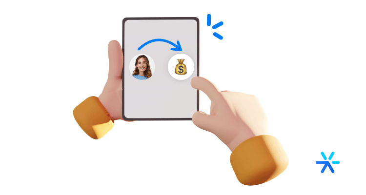
7. Use Eye-Catching Images
Images attract attention.
They capture interest much faster than text, especially in the first few seconds when a user glances at a page, article, or banner.
If you need to highlight your CTA, including an image is a smart choice.
However, make sure the image supports the CTA’s message without drawing more attention than the CTA itself.
8. Guide the User’s Eye
The CTA’s position should be carefully thought out in relation to the surrounding content.
If your visitor needs to read certain information first before reaching the CTA, make sure their eye is guided through the page elements.
Remember: Our reading pattern moves left to right, in lines, and from top to bottom.
9. Create a Sense of Urgency
Urgency is one of the most widely used and effective techniques in marketing and advertising.
If you want to instill urgency in your Call to Action, use terms like: “Get it now”, “Buy today”, “Request immediately”
This encourages quicker actions!
10. Be Clear and Direct
Your Call to Action must be specific.
In just a short phrase, your visitor should know: What happens when they click the button; What benefit they will receive; What action they need to take.
Focus on these three points and keep the CTA short and to the point.
11. Make It Look Easy
Your CTA should clearly convey that the action is easy to complete.
Even if your CTA leads to a form, for example, you need to assure visitors that it’s a simple process that won’t take much time.
12. Use Numbers Whenever Possible
Some people think using numbers might harm readability, but the truth is—numbers make benefits more tangible.
For example: “Buy now and get 50% off”, “Try free for 7 days”
This makes offers clearer and quickly grabs attention.
So, whenever your CTA includes a number, write it numerically rather than spelling it out.
13. Offer Something Truly Valuable
Users will only take action if they find real value in doing so. Make sure your CTA emphasizes the benefit.
Also, ensure the offer matches the level of effort required.
For instance, a CTA that only requires a click will convert better than one that asks for a long form with personal details.
The benefit must be worth the action the visitor is about to take.
14. Conduct A/B Tests
A/B tests involve modifying only one component at a time to determine which of two options yields better results.
You can change the color, article, format, or placement of the CTA.
However, we emphasize: it’s important to test and analyze one change at a time so you can pinpoint what made the difference and learn what works best for your audience.
According to VWO, a company specializing in this type of testing and offering tools for this specific purpose, nearly 30% of tests conducted by clients involve a Call to Action.
Some elements you can evaluate in your A/B test include:
- Button color;
- Keyword;
- Surrounding images;
- Value proposition article;
- Placement;
- Size;
- Format;
- Font.
Speaking of which… do you know which platform allows you to run A/B tests, compare, and analyze which versions work best?
That’s right: Leadster!
15. Continuously Optimize
Beyond constantly testing to analyze which versions of your CTA work best, it’s crucial to keep optimizing at all times.
To optimize your Call to Action, you can make changes to its structure and placement, as well as introduce new elements and adjust your strategy, for example.
Leadster even has a feature designed specifically for this purpose.
With our conversational marketing platform, you can continuously optimize the smart, personalized prompts you create.
What Not to Do in a Call to Action?

Here are some key points to avoid so that your CTA doesn’t get overlooked, go unnoticed, or lack persuasion.
Using Colors That Are Too Similar
If contrasting colors help highlight the CTA, using low-contrast colors does exactly the opposite.
When the CTA blends into the surrounding elements, it doesn’t get the attention it needs.
Cluttering Pages
Contrast and highlight elements should be used strategically, but going overboard can also harm your results.
Make sure your material guides the visitor’s attention to a main focus and that the CTA has enough white space around it to stand out.
Writing a Weak or Confusing Title
Confusing CTAs that don’t clearly state the action and the expected next step result in very low click-through rates.
The page title and CTA article should be well-aligned to create a coherent narrative that drives action.
For example, on a Wisconsin tourism website, one of the CTA buttons reads “Our Family Vacation”—which is vague and doesn’t prompt any clear action.
It’s safe to assume this CTA has very low click rates.
Neglecting Mobile Optimization
Remember that a large portion of users access social media and websites via mobile devices.
If your CTA isn’t mobile-friendly, you risk losing a significant percentage of potential clicks.
How to Measure Call to Action Results?
The main metric you should monitor for each CTA is the CTR (Click-through Rate).
CTR measures the ratio of total visitors who saw the Call to Action versus those who clicked on it.
It’s important to analyze this metric over time to track trends accurately.
You can calculate these rates using marketing automation tools (which also assist in creating and publishing CTAs) or Google Analytics.
Keep in mind: CTAs with different objectives will naturally have different success rates.
For example, convincing a visitor to read a full article about a topic of interest is easier than convincing them to sign up for a free trial of a product.
This factor should be considered when analyzing your CTA’s CTR.
Besides CTR, it’s also essential to track conversion rates, as this metric shows the percentage of visitors who actually complete the desired action.
A high CTR is meaningless if users don’t follow through with the intended action.
In fact, a high CTR but low conversions might indicate that:
- The CTA is not properly aligned with the intended action;
- There are issues with the landing page.
How to Track CTA Conversion Rates?

Since we’re talking about digital marketing, almost every action you take can be tracked and analyzed in detail.
Every CTA created with the best marketing tools is subject to analytics tracking in some form.
And since we’re dealing with websites, all CTAs can be analyzed in Google Analytics, especially in GA4, with event attribution models.
➡️ Learn more: Google Analytics 4 — How to Access, Set Up, and Use
CTA analysis can be incredibly detailed, offering valuable insights for Conversion Rate Optimization (CRO).
Let’s break it down:
1️⃣ How to analyze CTAs using dedicated CTA tools
2️⃣ How to analyze CTAs specifically within Google Analytics
Tracking CTAs in Google Analytics 4 with Google Tag Manager
The most reliable way to measure your CTA’s performance is through Google Analytics.
Here, we’ll discuss the most advanced method: Google Tag Manager (GTM).
By following these simple steps, you’ll be able to set up an event to track any button on your website and start collecting data.
It might seem complex at first, but it’s actually quite simple—there’s no coding involved, and it’s mostly about navigating menus and making selections.
Before we begin, if you’d like a deeper understanding of GA4 event tracking, click here.
Step-by-Step Guide
1️⃣ Create a Google Tag Manager account. Click here to access GTM.
2️⃣ Link GA4 with GTM.
- In your GTM dashboard, at the top, you’ll see an ID code—click it for integration instructions.
3️⃣ Activate click tracking in GTM.
- In the left menu, go to Variables and enable “Click” tracking (select all click-related options).
4️⃣ Create a trigger for CTA clicks.
- Go to Triggers > New and name it as you wish.
- Select “All Elements” and “All Clicks” as conditions.
- Click Publish (red button at the top).
5️⃣ Test your tracking setup.
- Next to Publish, click Preview & Debug.
- Open your website in another tab and click the CTA while holding CTRL (to prevent page reload).
- Go back to the GTM Preview tab—you should see the tracking data appear!
In the example below, the website Zozimus tracked Facebook button clicks using this method.
That name, “JSON-LD,” is the identifier of the button to be analyzed. Copy this information.
Go back to the click event you created and edit it with the information you just copied.
Done! Now your trigger is configured in GTM. What you need to do next is create a tag for this container and publish it for measurement in GA4.
Go to the left menu and click on “New Tag.” Then, name your tag, choose “Google Analytics 4” as the tag type, and enter your property identifier.
This identifier can be found in your Google Analytics under the “Tracking Code” section. Enter this code just below the tag type in the designated area.
There are some parameters you can add here to organize your data in Google Analytics. Edit them with this in mind: parameters are the information that will be displayed in the GA4 event.
Once that’s done, your event is now available in GA4 and can be measured directly from there.
How to Measure CTAs Through Marketing Platforms
As you noticed above, measuring CTAs is a task that, while simple, requires some technical knowledge of Google’s suite of tools.
However, there is another way to measure your CTA results: by working with them within marketing platforms.
In other words, your CTA is actually an element created through another platform and integrated into your website.
For example, you create an exit pop-up using HubSpot.
Here, measurement is absolutely simple: HubSpot itself provides you with information about the CTA.
Generally, this data includes the number of button clicks and, depending on the platform, even more details, such as how many people completed the original action after clicking the button.
This is the simplest way to measure CTA results. However, it is only available for CTAs created within these tools.
A Critical Analysis of the Best Type of CTA

We have already covered the theoretical and practical aspects of CTAs.
Now, we need to understand which type of CTA is the most worthwhile to use.
For example, we have seen that there are CTAs created directly within marketing automation systems.
At the same time, we also understand that some elements can be created and tracked directly on a website.
Additionally, there are CTAs that function as large images themselves—such as banners.
There is no single “best CTA” to analyze. Instead, different sites and industries benefit from different types of CTAs.
Below are some cases to help us better understand this situation. Follow along:
Marketing Platform Pop-ups — Ideal for Interrupting Reading
Marketing platform pop-ups are small forms or pure CTAs (without input fields, only a button) added to your site through a code generated by the platforms.
For example, if I want to insert a pop-up right after this paragraph, I would go to my marketing platform, create the pop-up, and then implement the code directly into my site’s source code.
It’s much easier than it sounds—believe me. In many cases, the entire process is done directly within the platforms.
These pop-ups are excellent for adding to your blog. They provide a break from reading while offering an opportunity to dive deeper into a topic the reader is already engaged with.
As a result, the chances of lead generation are much higher here than in some cases where CTAs of this type are placed directly on the homepage.
However, this is not always the case—it’s important to test and keep an open mind about the results.
Banners — Great for E-commerce
A more recommended type of CTA for e-commerce is banners—primarily characterized by their use of copy + image + button.
E-commerce stores need to showcase promotions and products in their CTAs to maximize sales opportunities.
Lead generation in e-commerce is still a reality, but the leads generated there tend to be further down the sales funnel.
Because of this, banners effectively display the most valuable information for an audience at this funnel stage: price, product, and promotion.
However, banners cannot be analyzed through marketing platforms. Instead, they must be tracked using Tags in GTM, as outlined in the tutorial above.
Direct Links (No Design) — Best for Blogs
There’s another type of CTA designed specifically for blog reading that shouldn’t be ignored—direct links.
You’ll find several of them within this article, with two main variations.
First, there’s the complete reading interruption link, like this one:
👉 Read also: Blog for Lead Generation — 10 Essential Strategies
Notice how it creates a clear break in the reading flow. You were reading, but you stopped because the link caught your attention.
But there is also another type of link: inline links, naturally inserted within the article.
For example, when discussing link parameterization—an essential step for tracking this type of CTA—we added a direct link within the paragraph without breaking the reading flow.
These links can also be tracked using Google Tag Manager, but the data is already available by default in Google Analytics 4 under the “Events” section.
Chatbots — A Versatile CTA for Any Scenario
If there is one type of CTA that fits all situations, it’s chatbots.
Chatbots can serve as CTAs for any purpose and can be placed on any page of your website.
Their functionality is simple: you configure message flows and user response options.
Here, call-to-actions are embedded within this flow, usually appearing as the first message the user receives.
You can see this process in action right here on this page. See that chatbot in the corner? That’s Leadster in action.
Because of their simple and adaptable nature, chatbots can be used for a variety of purposes. On a contact page, they can offer a faster way to request a quote.
On a blog article, they can provide additional resources. On a product page, they can offer a free quote in just five minutes.
This versatility is paired with a key ingredient for chatbot success: conversational marketing.
How to Increase Results with Conversational Marketing?
As we’ve discussed throughout this article, CTAs that require a complicated action from visitors tend to have lower click-through rates.
The offer needs to be genuinely relevant, and even then, if the process involves filling out personal data or multiple steps to register or test a product, visitors may be discouraged from converting.
A much more dynamic alternative to boost visitor action is conversational marketing.
With this approach, you provide easy-to-use experiences that engage visitors.
Using a virtual assistant or chatbot, you can set up personalized CTAs that initiate interactive conversations. This method helps collect contact information and qualify leads automatically by asking qualifying questions.
Now that you’ve learned a lot about Call to Action, you’re ready to create effective CTAs for all your materials and pages.
If you need more insights on the topic, we recommend analyzing examples of how businesses apply this strategy.
CTAs are all around you—everywhere!
You’ll likely start recognizing many of the tips shared in this article as you browse the web.